August 2, 2024 · Magati Joel
Building an Expense Tracker with Flutter and Provider
A look into how I built a clean, efficient expense tracking app using Flutter, Provider for state management, and fl_chart for data visualization.
Why This Project Exists
Small purchases rarely feel significant when they happen.
A snack here, transport there, a subscription renewed in the background—and suddenly the month's spending looks very different from what you expected.
I wanted to build an application that made those invisible patterns easier to notice.
The result was a simple Flutter expense tracker focused on quick entry and clear weekly insights.
The Problem
Expense tracking often fails because entering data feels like work.
If an application requires too many screens, fields, or decisions, users stop recording transactions.
The app therefore needed to make the core workflow extremely simple:
- Add an expense quickly
- Select a category
- Edit mistakes
- Delete old entries
- View weekly spending
- Understand spending patterns visually
The data also needed to update instantly across the interface whenever a transaction changed.
My Approach
I built the application with Flutter and used Provider for state management.
Expenses are stored in a central model that notifies the interface whenever an item is added, edited, or removed.
Instead of navigating to a separate page for every new expense, the application opens a modal bottom sheet. This keeps users close to the main dashboard and makes the entry process feel lightweight.
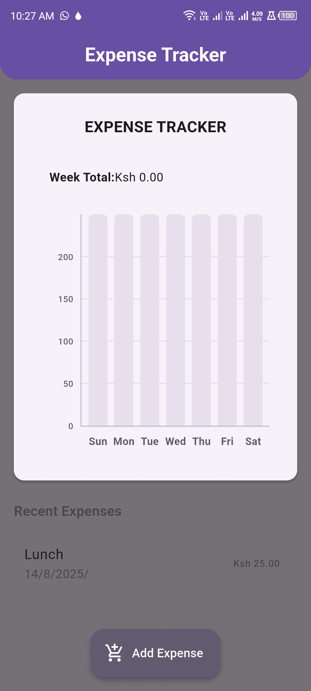
The weekly summary groups transactions by day and displays them using a bar chart built with fl_chart.
Users can immediately compare their spending across the week without reading through every individual transaction.
Interesting Challenges
Date grouping was more complicated than it first appeared.
Transactions needed to be assigned to the correct day while still handling different times and empty days. The chart had to show a complete week even if no expenses existed on certain dates.
Keeping the chart synchronized with the transaction list also required a reliable state-management flow.
Another challenge was designing the bottom sheet for small screens. The keyboard could easily cover important fields or buttons, so the layout needed to respond correctly when text inputs gained focus.
Editing an existing transaction also had to reuse the same form without confusing users or duplicating logic.
The Tech Stack
The project uses:
- Flutter
- Dart
- Provider
- Material Design
- fl_chart
- Modal bottom sheets
- Responsive layouts
Provider offered a straightforward way to keep the transaction list, totals, and charts synchronized.
Lessons Learned
The best expense tracker is the one users will actually continue using.
That means speed and simplicity are often more important than advanced features.
I also learned that visual summaries should complement the underlying data. The chart provides a quick overview, while the transaction list provides detail.
State management became easier once I separated business logic from the widgets responsible for displaying it.
Final Thoughts
This project may be smaller than some of my full-stack applications, but it taught me a lot about mobile interaction design.
The expense form, state updates, weekly grouping, and responsive chart all needed to feel immediate and natural.
Future versions could include categories, budgets, recurring expenses, cloud synchronization, authentication, and monthly reports.
For now, the app succeeds at its original goal: helping users notice where their money is going before the end of the month.